Thursday, April 30, 2015

Peter Bruegel the Elder, Landscape with the Fall of Icarus

Peter Bruegel the Elder, Landscape with the Fall of Icarus, c1558
28.9 x 44.1 in.

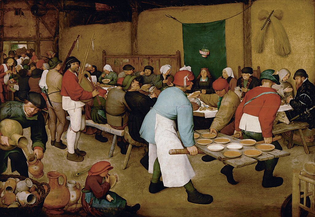
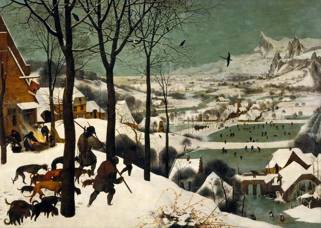
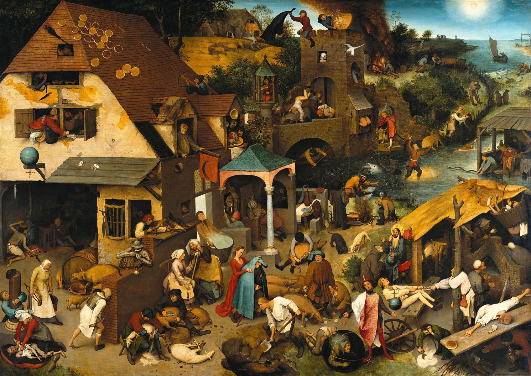
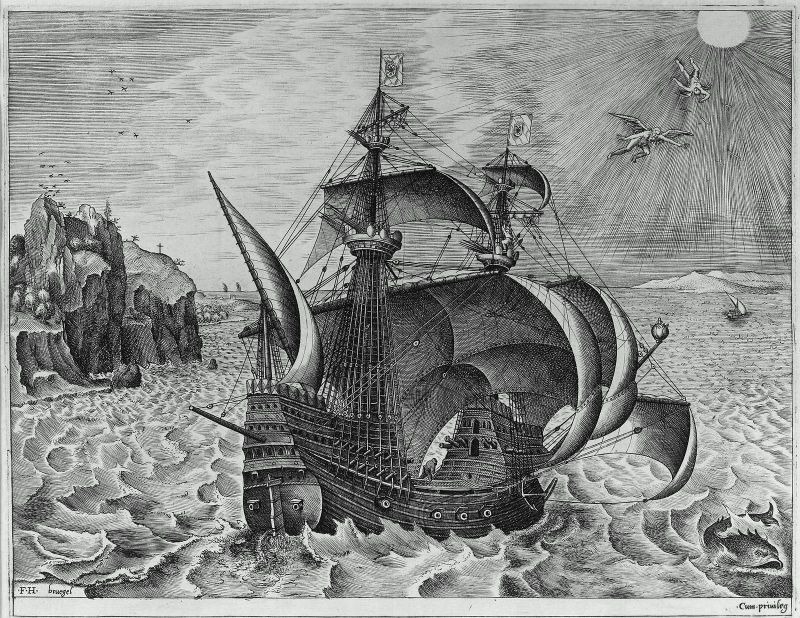
Peter Bruegel the Elder (1525-1569) was a Dutch Renaissance painter and printmaker, and one of the most major enduring figures of that group. Bruegel was born in or near the town of Breda and became an apprentice to the painter Pieter Coecke van Aelst, whose daughter, Mayken, Bruegel married. He traveled in France and Italy, and settled in Antwerp where he was accepted into the painter's guild in 1551. He later moved to Brussels. Bruegel had success in his life, receiving commissions from a number of wealthy patrons.  Both of his sons became successful painters, Peter the Younger and Jan the Elder. It is clear from his art that Bruegel was interested in the everyday lives of peasants and he even dressed up as a peasant to attend weddings and social events to gain inspiration and authenticity for his art. Indeed, peasant life is the subject of some of his most famous paintings. Landscape with the Fall of Icarus, a rather famous painting itself, is actually in the same vein. The authorship of this painting is actually in question and the version we have may in fact be a copy of Bruegel's original by one of his students or followers done around 1590, but the truth is unclear. Either way, it is Bruegel's own vision that is preserved for us. He devotes very little of the painting to the tragic death of Icarus, which one might expect to be the central and most exciting part of the painting. However, Bruegel shows us a different view of the myth. He depicted the story in an engraving from 1562 which shows an earlier moment of the story, with Daedalus flying and Icarus, too close to the sun, just beginning to fall. Even in that piece the father and son appear quite small compared to the ship and sea. In this painting, the beautiful landscape and laboring farmer are most prominent. The farmer on the cliff with his plow does not look up from his work, but a shepherd on the cliff below him does. He raises his head at the sound of a splash but is looking in the wrong direction and has no idea what has happened. In fact, Icarus is hard to see even for us. In front of the ship and near the shore, his leg sticks out from the water as he drowns. A nearby fisherman does not even seem to have noticed. This detail shows the small part of the painting where Icarus is seen. At first it may seem an odd choice to portray the myth in this way. However, it is quite profound and stunningly sad. Icarus flew too close to the sun and his wings melted, so he fell and drowned. But the world goes on without noticing. There is no stopping of work, no attempt to save him. No one even knows that his boy is dying. Nearby, Daedalus mourns and cries for his son, but here it makes no impact. Bruegel masterfully shows the senselessness of this death and the true tragedy of this life cut short.

Wednesday, April 29, 2015

Aleksandr Rodchenko, The Stairs

Aleksandr Rodchenko, The Stairs, 1930

Aleksandr Rodchenko (1891-1956) was a Russian artist who worked in many fields.  He was a painter, sculptor, photographer, and graphic designer.  He became an important spokesman in promoting the ideas of the government, particularly with his graphic design.  Born in St. Petersburg to a working class family, Rodchenko had not exposure to the art world when he decided to become an artist, drawing inspiration mostly from magazines.  He began studying at the Kazan Art School and then at the Stroganov Institute in Moscow.  There he created his first abstract drawings and paintings, influenced by the work of Kazimir Malevich, as well as Cubism and Futurism.  Rodchenko found success under the Bolshevik government and was given a bureaucratic job in which he helped found the Institute for Artistic Culture.  Rodchenko transitioned into photography, creating powerful portraits and images of the state apparatus.  The Stairs is a powerful and startling photograph.  Showing this woman alone, carrying her child is an evocative image.  Her loneliness appears to question the functioning of the state, especially in what looks like a central part of the city, but that may just be reading it with a modern eye. Certainly this woman appears powerful and determined.  The sharp contrasts and distinct shadows reinforce that impression.  The high vantage point and tilted angle of the photograph are quite off-puttting, putting the viewer in mind of something amiss and threatening.  While the meaning of this picture may not be entirely clear, the emotional resonances are undeniable and the depth and skill that Rodchenko brought to his work are evident.

Tuesday, April 28, 2015

Death of Polyxena from De Mulieribus Claris

Death of Polyxena, from De Mulieribus Claris, 1403

The artist behind this image is unknown, but it was created in France for a 1403 edition of Bocaccio's De Mulieribus Claris.  Bocaccio first published De Mulieribus Claris, which means "On Famous Women", in 1378.  It features the biographies of one hundred and six historical and mythological women, and is the first such collection devoted to women.  It begins with Eve and continues through Bocaccio's own time, ending with Joanna I of Naples.  It includes goddesses like Venus and Isis, mythological figures like Clytemnestra and Penthesilea, and historical figures like Cleopatra and Agrippina.  Bocaccio was inspired by Petrarch's On Famous Men and in turn influenced a number of similar works about women, including Chaucer's Legend of Good Women. I find this depiction of Polyxena particularly interesting.  Polyxena was a Trojan princess who was sacrificed at the end of the Trojan War to aid in the Greeks' return home (they left Greece with the sacrifice of an innocent girl, so no reason they shouldn't get back the same way). Polyxena is resigned to her fate and prefers to die in Troy than to live on as the slave to a Greek soldier (the fate of many Trojan women).  This illumination bears many hallmarks of medieval illustration, with its flat space and stilted poses, but there is also something extremely sophisticated bout it.  Most of this interest comes from the expression on Polyxena's face.  The artist managed to convey Polyxena's resignation and weariness, as well as her sadness.  This sadness is for herself and for her city and people, so utterly destroyed.  Even the Greek soldier's face is complex, registering something perhaps close to remorse.  Notice that Polyxena's hands are folded in her lap; she waits calmly for the sword to fall, a bitter end to the tragedy of Troy.

Monday, April 27, 2015

Jean-Baptiste-Siméon Chardin, Young Draughtsman

Jean-Baptiste-Siméon Chardin, Young Draughtsman, c1738

Jean-Baptiste-Siméon Chardin (1699-1779) was a prominent French painter.  Although he is often classified a Rococo painter due to his time period, Chardin's work had little in common with the ornate style and grand paintings of the movement.  Born in Paris, his father was a cabinetmaker. He became an apprentice to a number of established history painters and in 1724 he became a master at the Académie de Saint-Luc.  In 1728 Chardin was admitted to the Académie Royale up the presentation of The Ray.  Still-life became one of Chardin's primary genres, particularly scenes of hunted animals.  Chardin is best known for his intimate domestic interiors, often depicting the activities of young men.  Chardin elevated these drawings to the highest level and was considered one of the preeminent painters in France during his lifetime. This depiction of a young draughtsman is one of Chardin's most famous subjects, and he returned to it twelve times over a twenty year period.  Chardin was somewhat impatient with the arduous training young artists underwent, which this piece shows.  This artist, representative of Chardin himself (at least thematically), sits hunched over his sketch board in threadbare clothing and the warm coat suggests the studio is very cold.  The young man is learning to draw figures, first by copying a study by a master before eventually moving on to live models.  Notice the delicacy of Chardin's brushwork in the rendering of the coat, which is repeated in the texture of the canvas and wall. The piece also demonstrates masterful use of light and shadows to create the picture space. Some of the interest of the piece lies in the status of artwork.  This painting contains two or three other artworks within it: the original study being copied, the sketch the boy is producing, and the blank canvas to the right which will eventually become an artwork as well.

Sunday, April 26, 2015

Bartolomé Esteban Murillo, Two Women at a Window

Bartolomé Esteban Murillo, Two Women at a Window, 1655-60
49.25 x 41.125 in.

Bartolomé Esteban Murillo (1617-1682) was a Spanish Baroque painter.  Born in Seville, he was the youngest of fourteen children, but his parents died when he was young and was brought up by his aunt and uncle from then on.  Murillo began his art studies under the tutelage of Juan del Castillo, who first exposed him to Flemish painting.  Murillo's early works are influenced by great Spanish painters of the previous years, such as Zurbarán and Ribera, and he likely encountered the work of Velázquez when he moved to Madrid in 1642.  In some ways, Murillo's work became a synthesis of Flemish painting and these Spanish masters.  Although best known for his religious paintings, of which there are many, Murillo also painted a number of scenes of peasants and domestic scenes.  Two Women at a Window demonstrates Murillo's interest in everyday life and his excellent use of tenebrism.  The black background perfectly emphasizes the presence of these women.  These smiling women are likely an upper class pair (covering your mouth while laughing was considered good etiquette among Spanish aristocracy) and the standing woman may be the younger girl's chaperone.  It is important to note that these figures are life size and they are very convincingly modeled.  Murillo's skill is evident in the use of brushwork and shading to render these women.  The use of a window opening to frame the painting and simulate a real window is a trick from Dutch painting.  With the open window, life sized figures, and realistic depiction, and given the right setting, the painting could be mistaken for a real window with a real pair of laughing women––at least for a moment.

Saturday, April 25, 2015

Hanna Pauli, Breakfast Time

Hanna Pauli, Breakfast Time, 1887
36 x 34 in.

Hanna Hirsch-Pauli (1864-1940) was a Swedish painter who played a major role in the Scandinavian art scene of the late 1800s.  She was born in Stockholm and attended the Royal Swedish Academy of Arts there.  Like many Scandinavian artists at the time, her work combines elements of Impressionism and Realism.  Among her best known works is her portrait of sculptor Venny Soldan.  The piece shows a realistic style and sensibility and and extremely nuanced rendering of Soldan.  The portrait was accepted to the Paris Salon in 1887.  That same year Hirsch married Georg Pauli.  The home they made together became a gathering place for the leading Swedish cultural figures of the day.  Breakfast Time is probably Pauli's most famous painting.  It features soft, layered brushwork and warm, rich textures.  The painting features an unusual composition, where the well-appointed table becomes the focus of the piece and the single figure recedes into the background.  The painting skillfully combines still-life, portrait, and landscape to create a very complex painting.  Another interesting element is the use of light; the sun shines through the trees to create a dappled effect that instills the viewer with the feeling of shade on a warm day.  The light glints on the tea kettle and other features of the spread, while again casts the woman into shadow.  Pauli is demonstrating the way in which this woman, apparently a server, becomes a feature of the breakfast herself.  Meanwhile the finely rendered landscape is brightly lit, creating an effect of the wide and beautiful landscape that lies just beyond the picture space.

Friday, April 24, 2015

Nzante Spee, The Wahdoosee Question

Nzante Spee, The Wahdoosee Question, 1994

S. Nzante Spee (1953-2005) was a Cameroonian artist.  Born in Mbem, Cameroon, he began his artistic career by painting signs and façades for local businesses.  In 1976 he began to study fine arts in Nigeria and Côte d'Ivoire and by the time he finished in 1982 he had already made a name for himself as a great talent.  In the following years he won a number of awards in Africa and began participating in international exhibitions, particularly in France.  Spee became an influential figure in Cameroon, where he had to fight to make a place for himself as an artist in society.  He has inspired countless young artists in Cameroon to pursue their work.  Spee's particular style combines elements of traditional African art with European styles, especially Surrealism and Cubism.  Spee's work is inspired by music and movement with bright colors that show the intense ecstasy with which he experienced the world.  The Wahdoosee Question is exemplary of Spee's style.  There is intensely surreal imagery presented, with bright birds and distorted people populating the space.  Faces hang in the bright green sky and shapes that seem almost identifiable blanket the ground.  This is an imposing painting, whose brightness and complexity make it difficult to read but highly intriguing.  I find the painting powerful and effective, giving us a glimpse of how Nzante Spee saw the world.

Thursday, April 23, 2015

Carl Gustav Carus, Stone Age Mound

Carl Gustav Carus, Stone Age Mound, 1820

Carl Gustav Carus (1789-1869) was a German painter who was also a doctor, physiologist, naturalist, and psychologist.  Born in Leipzig, Carus received a doctorate of both medicine and philosophy in 1811 and became a professor of obstetrics in 1814.  He had already taken some drawing classes and he wrote on art theory as a hobby.  Around his time Carus began teaching himself painting, with some instruction from Caspar David Friedrich.  Carus's scientific successes included an appointment as personal physician to the King of Saxony, and an archetype of vertebrate physiology.  Carl Jung credited him with being the first to "point to the unconscious as the essential basis of the psyche."  Although his writing on art theory became well known and made him a leading scholar of his time, Carus considered his painting little more than a hobby. As a painter, he was concerned almost exclusively with landscape.  He demonstrates great draughtsmanship and natural talent, as well as en excellent feel for Romantic drama (he was, after all, close friends with Johann Wolfgang von Goethe).  Stone Age Mound is a beautiful example of Carus's skill.  There is great sensitivity in his use of line to shape the contours of the earth, and his colors are subtle but rich.  The careful interplay of earth, water, sky, and sun gives the painting a complex intensity that is mysterious and engaging.

Wednesday, April 22, 2015

Henri Gervex, A Session of the Painting Jury

Henri Gervex, A Session of the Painting Jury, c1883
118.11 x 164.96 in.

Henri Gervex (1852-1929) was a French painter who found success with a number of important commissions around Paris.  The son of a piano-maker, a family friend secured him a place in the studio of Pierre-Nicolas Brisset when he was fifteen.  In 1871 he was admitted to the École des Beaux-Arts.  He first exhibited at the Salon in 1873 and won a medal the following year.  Despite his early success, Gervex soon became controversial for his frequent use of nudes.  His 1878 painting Rolla was rejected from the Salon for indecency, due to its depiction of a prostitute. However the painting was exhibited at a private gallery, and attracted unprecedented crowds due to the scandal, which Gervex took great pleasure in.  In the following years he traveled extensively and received commissions for public buildings in Paris, as well as a number of hotels and restaurants.  He was perhaps best known in his lifetime for his masterful depictions of French society.  A Session of the Painting Jury depicts a rarely seen aspect of the Salon process–the jury actually viewing and judging the artworks.  The painting demonstrates the importance placed on these sessions and their importance for painters.  Those raising their hands, canes, and umbrellas are voting for the acceptance of the piece.  It appears this particular painting has not done ver well, and some members have already turned away, ready to move on.  Meanwhile there is great activity around them as other pieces are installed and discussed.  Gervex implements a very controlled hand here.  While some of his paintings use looser brushwork, in this work the lines are quite crisp and everything is depicted realistically.  Gervex had a strong academic background and uses those skills to show us what happens behind the scenes at the Academy.

Tuesday, April 21, 2015

Sean Scully, Catherine

Sean Scully, Catherine, 1989
102 x 136 in.

Sean Scully (b.1945) is an Irish-born painter who works out of New York.  Born in Dublin and raised in South London, he attended Croydon College of Art and Newcastle University. After a graduate fellowship took him to the United States, he decided to settle in New York in the early 1970s.  Scully's work consistently features patterns of stripes and lines, influenced by architecture, landscapes, textile, patterns, and artists such as Mark Rothko and Piet Mondrian. Throughout a number of personal hardships, Scully has always continued painting. Although they lack any figurative content, they are rich with emotional content and become totemic. Scully now lives with his second wife, the artist Liliane Tomasko. The "Catherine Series" was painted between 1979 and 1996 during his marriage to Catherine Lee. Together, the couple would select one painting a year from Scully's annual output to be a member of the series, and each named Catherine. The series presents, not only a selection of some of Scully's best works, but also a picture over time of his art. This 1989 entry is an excellent example of Scully's signature style. He uses thick paint with a lot of texture to create his surfaces. His paintings have a somewhat rustic, worked over feel, which makes them extremely engaging and inviting. His colors are especially warm, and they are intense but never imposing. Scully's large canvases make a significant impression and a powerful statement, offering a worldview that is both geometric and emotional.

Monday, April 20, 2015

Eadweard Muybridge, Pi-Wi-Ack (Shower of Stars), Vernal Falls, 400 Feet, Valley of Yosemite

Eadweard Muybridge, Pi-Wi-Ack (Shower of Stars), Vernal Falls, 400 Feet, Valley of Yosemite, 1872

Eadweard Muybridge (1830-1904) was an English photographer known for his pioneering motion studies and early experiments with motion picture projection.  After a quiet childhood in England, he moved to the United States where he lived in New York and then San Francisco.  He became a successful bookseller, but after a serious stagecoach accident in 1860 he took up photography while recovering in England.  He returned to San Francisco in 1867 as a professional photographer and had success shooting landscapes and architecture.  In 1872 Muybridge was hired by racehorse owner and former California governor Leland Stanford to answer the hotly debated question of whether all four feet of a horse's feet are ever off the ground while trotting. Muybridge answered the question with a study of one of Stanford's horses, demonstrating that all four hooves did leave the ground at once.  This set off his interest in motion studies, perfecting his method of studying horses in 1878, and projecting them to form what is sometimes considered one of the first silent films.  In the following years Muybridge did motion studies of other animals and people. He remains best known for this important work but his landscape photographs are quite impressive.  The beautiful example of a waterfall at Yosemite demonstrates the scale of his work and the physical risks he took to produce his images.  

Sunday, April 19, 2015

Olga Rozanova, Blue on Tin

Olga Rozanova, Blue on Tin

Olga Rozanova (1886-1918) was an avant-garde Russian artist who worked in Suprematism and Cubo-Futurism.  Born in a small village to the east of Moscow, she began formally studying art in 1904 at the Stroganov School of Applied Art and in the studios of several prominent Moscow painters.  She became and active member of the group known as Soyuz Molodyozhi (Union of the Youth) and became involved with the Futurist poets, including her future husband.  In 1916 she joined the avant-garde group that was led by Kazimir Malevich.  Rozanova's work spans a number of styles and aesthetics, including Primitivism and Fauvism, but her Cubist and abstract pieces stand out among her work.  She did a series showing abstracted playing cards.  Some of her works prefigures Abstract Expressionism by decades.  Sadly, Rozanova died of diphtheria in 1918.  Blue on Tin is a beautiful piece where weight and color are explored quite masterfully. Rozanova organizes these shapes into a geometric pattern, but infuses them with the presence of a figure or landscape.  This is in part because the painting recalls many natural formations—mountains, the sun, feathers, an eye—without being a representation of any of these things.  She lays her paint thickly, and with great texture.  The blue is thick and monolithic in some places, and shaped with a wide gradient in others.  The painting is a masterpiece of early abstraction and a powerful example of the intensity and beauty that Rozanova brought to her work.

Saturday, April 18, 2015

Jules Bastien-Lepage, October

Jules Bastien-Lepage, October, 1878

Jules Bastien-Lepage (1848-1884) was a French painter associated with Naturalism, a type of Realism. Born in a small village, his father worked at a vineyard and Bastien-Lepage took an early interest in drawing, especially for the fruit trees that grew in his grandfather's garden.  His parents bought prints of paintings for him to copy and his father became his first art teacher.  In 1867 he moved to Paris and was accepted into the École des Beaux-arts.  After being wounded in the Franco-Prussian War, Bastien-Lepage returned home to paint the farmers and rural scenes of his home village.  In the late 1870s, he had significant success and became known as the leader of his school.  Although he painted some mythologicalreligious, and literary scenes, he was always best known for his portraits and scenes of rural life.  Perhaps his two best regarded pieces, both in his lifetime and today, are Haymaking (1877) and his portrait of famed actress Sarah Bernhardt (1879).   October is an excellent example of Bastien-Lepage's style and skill.  It depicts the autumn harvest with these two women hard at work gathering potatoes, while other laborers are visible in the distance.  The artist's soft palette and brushstrokes are perfectly balanced, with the scene taking on a bucolic idealism.  This detail of the woman's face shows the great care that Bastien-Lepage devoted to his work and the beauty of every stroke of his brush.

Friday, April 17, 2015

Jack Tworkov, Blue Note

Jack Tworkov, Blue Note, 1959

Jack Tworkov (1900-1982) was a Polish-born American painter who was a member of the New York School which created Abstract Expressionism.  Tworkov moved to the United States in 1913 with his mother and younger sister, an artist in her own right named Janice Biala.  He attended Columbia University, planning to become a writer, but decided to pursue art after seeing Cézanne and Matisse.  He then studied at the National Academy of Design and the Art Students League. He initially met Willem de Kooning and then joined the other Abstract Expressionists in founding the New York School.  Tworkov's art bears some resemblance to other painters in the group, but he is known for his large gestures of color.  Even his early figurative work shows this technique, coming to full force when he embraced pure abstraction.  In the sixties he began exploring lines and grids, eventually progressing to a more mechanical modernism.  Blue Note is an excellent expression of Tworkov's signature style.  Her the swaths of color lick the canvas, flamelike, and dance across the composition.  Tworkov blends these colors, while also causing them to clash.  There is a roughness and harshness to his approach, that particularly conveys the physical labor of painting.  The visceral elements of the work stand out prominently and communicate the intensity with which Tworkov approached the piece.

Thursday, April 16, 2015

Sebastiano Ricci, Satyr and a Farmer

Sebastiano Ricci, Satyr and a Farmer, c1700

Sebastiano Ricci (1659-1734) was a prolific Italian painter of the late Baroque period.  Born in Belluno, he became an apprentice in nearby Venice.  After a hurried marriage that resulted from an unwanted pregnancy, and after being briefly jailed for the attempted poisoning of the young woman, Ricci and his new family moved to Bologna and his technique became a mix of Venetian and Bolognese styles.  He began to receive commissions and have artistic success, however he continued to be a horrible man, and Ricci abandoned his wife and daughter in Bologna.  He fled to Turin with the young daughter of another painter but was arrested and nearly executed, but for the intervention of the Duke of Parma.  He spent the next several years working all over Italy on various commissions.  He also worked in London and Paris.  Proving that the wicked are not necessarily punished for their misdeeds, Ricci died a rich and successful man.  Like most artists of the period, he painted mostly history paintings, often scenes from mythology and the Bible.  He did also paint some genre pieces.  What I find fascinating about Satyr and a Farmer is the mixing of mythological and genre painting.  This is a genre scene, of a simple farmer and his family eating a meal outside their home.  However Ricci inserts a Satyr into the scene.  This undermines the intention of genre pieces, to depict the reality of everyday life, and calls attention to the element of fantasy at play in all art.  Ricci's skill is on display here in the sensitivity of his brushwork all over the canvas, but particularly in the rendering of the satyr's legs, where the fur and hooves are quite detailed and lifelike.  There is also a naturalism about the satyr's pose and body.  Therefore, the genre painting is made fantastical by the presence of the satyr, while the satyr is also made more realistic and naturalistic by his context in the genre painting.

Wednesday, April 15, 2015

Joaquin Sorolla, Seashore

Joaquin Sorolla, Seashore, 1906

Joaquin Sorolla y Bastida (1863-1923) was a Spanish painter who worked in a number of genres, and was particularly noted for his portrayal of the Spanish sunlight.  Born in Valencia, he began studying art at age nine.  When he was eighteen he moved to Madrid and began studying the old masters hanging in the Prado.  He won a grant to study in Rome for four years and found a lot of support at the Spanish Academy there.  He traveled to Paris in 1885 where he got his first exposure to modern painting.  He returned to Spain in 1888 where he married his former teacher's daughter.  Most of his works in this early period were history paintings, but he soon progressed into portraits and genre scenes.  He began painting his most recognizable works, large Valencian beach scenes.  Sorolla painted quite a number of these scenes, showing people from all ages and walks of life enjoying the beach.  Much of his work bears some resemblance to Impressionism, but the influence of the Spanish climate and culture is immense.  Sorolla also demonstrated a highly developed relationship to form and color, beyond their role in the rendering of a particular scene.  Seashore is an example of this tendency.  In this beach scene, the landscape is far less realistic.  The shapes and bands of color seems to exist for themselves rather than inservice of the beach, almost suggesting the ethos of abstraction.  The rich, bright colors and large, visible brushstrokes are beautifully utilized in this piece to convey the intense brilliance of this sunset and the blazing light of the beach.

Tuesday, April 14, 2015

Jean-Auguste-Dominique Ingres, Portrait of Countess d'Haussonville

Jean-Auguste-Dominique Ingres, Portrait of Countess d'Haussonville, 1845
51.9 x 36.2 in.

Jean-Auguste-Dominique Ingres (1780-1867) was one of the great Neoclassical painters, following in the footsteps of Nicolas Poussin and his own teacher, Jacques-Louis David.  Ingres became the guardian of French academic tradition in the face of rising Romanticism, led by Ingres's nemesis, Eugène Delacroix.  Born in Southern France, Ingres's father was a decorative artist, sculptor, and amateur musician.  His first instruction came from his father.  In 1797, he was awarded first place in drawing by the Academy, which earned him a place in Paris studying with David.  He also studied at the École des Beaux-Arts and then won the prestigious Prix de Rome in 1801 for The Ambassadors of Agamemnon visit the tent of Achilles.  Having established himself as the next great history painter, he was soon commissioned to produce a portrait of Napoleon enthroned.  His most famous painting is undoubtedly Grande Odalisque (1814).  Ingres continued to produce large-scale history paintings, often of Classical subjects, by the end of his career he was better known for his portraits, which were expected to be his greatest legacy.  This portrait of the Countess d'Haussonville is one of the finest examples of Ingres's portrait painting. The painting demonstrates his excellent draughtsmanship and attention to line.  We can see the fine drapery of the dress, as well as the soft and delicate rendering of the subject's skin.  The use of the reflection was a very unusual device for the time, particularly for a traditionalist such as Ingres.  The reflection causes a doubling effect and suggests a painting's ambiguous reality, both thing itself and mere representation.  While these resonances may not have been deliberate for Ingres, it is impossible to view this painting with a modern eye without such complexities. Meanwhile, the beautiful Countess wears an expression of great savvy and intelligence.  She comes across as powerful and engaged, in command of her space, and gazing out at the viewer across the centuries.

Monday, April 13, 2015

Sabra Field, Going Home

Sabra Field, Going Home, 1980

Sabra Field (b.1935) is a contemporary American artist who lives and works in Vermont.  Born in Tulsa, Oklahoma, she grew up in New York.  Field attended Middlebury College and gained an understanding of art there.  She decided to become an artist while at school, but considers her professional career to have begun in 1967 when she moved to a small village in Vermont.  Many of her works reflect this setting, often interpretations of the Vermont scenery.  She also makes prints depicting interior scenes and other environments, and even an illustration of the myth of Demeter and Persephone.  She continues to work, producing new prints and images.  Going Home is a particularly beautiful piece, an image that is both haunting and warm.  Field has commented that this work is not a depiction of a particular place, but rather the process of going home, as it exists for each individual.  Field's use of light and space is quite powerful.  The sky glows and the gradient from blue to orange is well done, but it is also mirrored in the rendering of the mountains.  They are in silhouette, but the way the mountain lightens toward the ground suggests an inner glow, as well as the possibility that a town lies just out of sight, waiting for us to travel this curving road.  Field also includes the subtlest promise of a rest house along the way, visible only due to the lighted windows.  Finally, the road itself is a pale beacon within the dark woods.  The entire print is composed so that the concept of home is represented by light and warmth, waiting below our feet, on the side of the road, or just out of view, but present nonetheless.

Sunday, April 12, 2015

Eugène Atget, Shop Sign

Eugène Atget, Shop Sign, 1899

Eugène Atget (1857-1927) was a French documentary photographer and a pioneer of experimental photographic techniques.  After serving in the merchant navy, Atget became an actor in a traveling group, but had to give it up after an infection of his vocal chords.  He attempted painting with no success, and became a photographer around 1888, taking it up professionally in 1890. Atget was committed to documenting the streets of Paris before they disappeared with modernization.  He utilized unusual techniques, such as reflection, to create powerful and haunting images of Paris and its people.  In this photograph, the full title of which is Shop Sign, the Grinder on the corner of the rue des Nonnains-d'Hyères and rue de l'Hôtel-de-Ville, 4th arrondisment, Atget used a long exposure to create the ghostly repetition of these figures.  He shows Paris in motion and the busy life of the city.  This photograph also demonstrates remarkable use of depth of field, to show the activity all the way down the street. Atget produced hundred of images of Paris.  He preserved the appearance of the city and influenced generations of artists and documentarians.

Saturday, April 11, 2015

Victor Pasmore, Square Motif, Blue and Gold: The Eclipse

Victor Pasmore, Square Motif, Blue and Gold: The Eclipse, 1950

Victor Pasmore (1908-1998) was a British artist and architect who made major strides in the rise of abstract art in Britain.  After taking an administrative job to support his family, he studied painting part-time at the Central School of Art.  Many of his earlier works are misty landscapes, presenting a dreamlike view of the Thames.  He turned to pure abstraction in 1947, often employing unusual materials, and working in sculpture and construction as well as painting. Pasmore's art developed over the following years, and he continued to experiment with new styles throughout his life.  The painting I have chosen to feature is from the height of Pasmore's early success.  This piece has some influence from Constructivism, which celebrated a machine aesthetic, but there is also something distinctly organic about it, despite the grids and angular shapes.  The painting seems to draw on landscape composition, with a horizon line, a golden sky, and even a disc to replace the sun (a notion enhanced by the subtitle of "Eclipse"). However, the pure abstraction of the piece is pervasive, and reading traditional figuration into it too much is dangerous.  Pasmore manages to convey both flatness and depth, both stillness and motion. This is achieved through the contrasting shapes, where the rectangles and triangles in the lower portion are static, but the curves and swirls that radiate from the disc in the upper portion are dynamic and moving.  This gives the painting continual interest, because our perception of it is constantly shifting.  Meanwhile, the painting is also, quite simply, a beautiful exploration of shape and color.

Friday, April 10, 2015

Laureys a Castro, A Storm at Sea

Laureys a Castro, A Storm at Sea, 1685
13 x 20.5 in.

Laureys a Castro (or Lorenzo de Castro) was a Flemish painter of seascapes.  His exact dates are unknown but he was first active in Antwerp around 1665 and died around 1700.  Another Flemish marine painter, Sebastian Castro, is assumed to be his father; Laureys is recorded as the son of a master in the records of the Guild of St. Luke (the painters' guild).  The family was of Portuguese descent and likely moved to Antwerp to escape the persecution of Jews during the Portuguese Inquisition.  Based on his subjects, it seems clear that Laureys traveled around Europe and studied different ports.  Although he was also a portrait painter, Castro is best known for his depiction of ships at sea and in port.  He is particularly known for his work during his time in England.  His best known works depict naval battles such as the Battle of Actium.  A Storm at Sea is a more dramatic painting than many of Castro's works.  The entire painting is composed to instill the terror of the storm.  Firstly, the whole scene is portrayed on an angle: along with the tilting ship there is a tilted horizon, which gives the viewer the sense of being on a careening deck. The rolling clouds and churning ocean successfully convey the winds and waves of the storm. Notice also the port that appears on the right of the canvas.  The four ships we see (one is near the middle in the deep background, barely visible against the sky) are all so near a safe port in the storm, but in the moment that Castro chose to depict, it is unclear whether they will make it to safety before the storm swallows them.

Thursday, April 9, 2015

Francisco de Zurbarán, The Death of Hercules

Francisco de Zurbarán, The Death of Hercules, 1634
53.5 65.7 in.

Francisco de Zurbarán (1598-1664) was a Spanish painter, particularly known for his depictions of monks, nuns, and martyrs.  The son of a haberdasher, he began drawing with charcoal when he was a small child.  When Francisco was sixteen, his father sent him to Seville to be apprenticed to an artist.  His first major commission was a contract with a Dominican Monastery in Seville in 1626.  Zurbarán produced twenty-one paintings for the monastery in eight months.  Zurbarán became known as the Spanish Caravaggio due to his heavy and effective use of chiaroscuro. The technique is especially evident in one of his best known works, a painting of St. Francis according to a vision of Pope Nicholas V.  In that painting, the Saint stands in his monk's robe against a completely black background, with the texture and shading of Francis and his garment the only content of the painting.  The Death of Hercules is one of several paintings Zurbarán did of the Classical hero (for example he also depicted him fighting the Nemean Lion and the Hydra). Hercules died when he was given a tunic dipped in the poisonous blood of the centaur Nessus, who is visible on the right in the background.  This piece includes Zurbarán's trademark chiaroscuro, and has a number of other interesting elements.  Perhaps the most unusual aspect is the visual depiction of Hercules' pain.  As the poisonous garment burns him, we see literal flames surrounding his body.  This technique is very unusual and makes the pain visceral and immediate, impossible for the viewer to ignore or not identify with.  There is also a way in which Zurbarán seems to unite Hercules with the Christian martyrs he depicted so frequently.  By showing the burning this way, his pain becomes our pain, and the suffering of his death becomes very present.

Wednesday, April 8, 2015

Henri Le Sidaner, Place de la Concorde

Henri Le Sidaner, Place de la Concorde, 1909

Today's painting is in many ways quite similar to yesterday's.  Painted almost the same year, they are both dreamlike portraits of their city, one is so Paris and one is so New York.  I think they make a fascinating and beautiful pair.

Henri Le Sidaner (1862-1939) was a French artist who is very difficult to classify into any particular movement, and his reputation has suffered for it.  Born in Mauritius, his family settled in Dunkirk when he was eight years old.  He studied at the École des Beaux-Arts, but left before his schooling was complete because he broke with his teacher, Alexandre Cabanel, over artistic differences.  He retained the wandering spirit of his early childhood and traveled all over France and Europe.  Le Sidaner drew on many contemporary movement, Post-Impressionism, Pointillism, Fauvism, Symbolism, but he belongs to none of them.  This is partly due to his own insistence; he refused to be classified, and when pressed declared himself "an intimist."  He was described by a friend as "a sort of mystic with no faith."  Le Sidaner's work is very interesting, demonstrating an interest in a wide variety of subject matter.  He painted cityscapes and landscapes, a self-portraitstill-lifegenre paintings.  Place de la Concorde (sometimes called Paris in the Rain) is a very atmospheric piece.  The wet cobblestones reflect the modern streetlights, while the famous monuments of Paris rise behind the expanse of the street.  While this image is quite small, an excellent detail shows the intense care that went into the brushwork and the artist's ability to make a powerful artwork out of small and disparate pieces.  Le Sidaner had mild success in his lifetime but his refusal to be a member of any artistic group damaged his success and his legacy after his death.  However, only this past year, he had a retrospective in Paris and he is now seen as a fascinating, talented, and idiosyncratic painter, worthy of further study and exhibition.

Tuesday, April 7, 2015

Julian Alden Weir, The Bridge: Nocturne or Nocturne: Queensboro Bridge

Julian Alden Weir, The Bridge: Nocturne or Nocturne: Queensboro Bridge, 1910
29 x 39.5 in.

Julian Alden Weir (1852-1919) was an American painter who worked in Impressionism and was a founding member of "The Ten," a group of anti-establishment artists who exhibited their works independently, rather than within the structures of professional art organizations.  In this way they were perhaps American equivalents to the original Impressionists.  Weir was born in West Point, New York where his father taught drawing at the Military Academy.  Robert Weir had been an instructor to James McNeil Whistler.  Julian Weir studied at the National Academy of Design and then at the École des Beaux-Arts in Paris.  There he studied under Jean-Léon Gérôme.  When he first encountered Impressionism in Paris, he was horrified by their lack of draughtsmanship and the subjectivity of their depictions of nature.  At this point in his career Weir was well-regarded in Europe for his academicism.  However, due in part to a friendship with Whistler and an affinity for Manet, Weir's attitude toward Impressionism softened and he eventually adopted the style himself.  Finding success in landscapestill-life, and portraiture, Weir became one of the leading American painters and a standard bearer of American Impressionism.  This nocturne of the Queensboro Bridge, which opened only the previous year in 1909, is one of Weir's most stunning pieces.  With its palette of greys, greens, and golds, the piece recalls the work of Whistler, but Weir also communicates a sense of scale and majesty.  The bridge, barely discernible in the distance, looms over the city and dwarfs the minuscule cars.  The intense atmosphere of this painting is created by the use of fog and the loose brushstrokes that make the whole painting awash in the color of night air.

Monday, April 6, 2015

Liliane Tomasko, Night Shifting

Liliane Tomasko, Night Shifting, 2014
56 x 50 in.

Liliane Tomasko (b.1967) is a contemporary artist from Zurich.  Tomasko studied photography and sculpture at London's Royal Academy of Arts.  Afterwards she moved toward painting and works on paper, drawing on her experience in photography and sculpture.  Her work is quite varied, ranging from explorations of domestic spaces, to abstracted landscapes, to pure abstraction.  She often paints from polaroids, particularly in her pieces depicting folded linens, which she explores in extreme closeup.  Some of her work examines the relationship of light and line, resembling a striated desert or light shining on wood.  When she works in abstraction, Tomasko's work explores the fluidity of color and how we use it to create shapes and forms. Night Shifting is a captivating piece that calls into question our perception of shape and form. Many recognizable images seem to emerge as we study the canvas, a tree here or an animal there, but when we look again there is only a knot of colored lines.  These almost figures populate the painting and make it a work of unending interest.  The shapes we think we discern are our brains attempting to read order into this chaotic scape of color.  The earthy tones that Tomasko employs are very evocative, suggesting the depths of the ground and the spread of blood.  Tomasko uses these colors and her thick brushwork to create an extremely effective painting.

Sunday, April 5, 2015

Lucian Freud, Landscape with Birds

Lucian Freud, Landscape with Birds, 1940
12.7 x 15.5 in.

Lucian Freud (1922-2011) was a major British painter.  Born in Germany, he was the grandson of Sigmund Freud.   The family moved to London in 1933 to escape Nazism.  Lucian Freud studied at the Central School of Art and the East Anglian School of Painting and Drawing.  He is known for his portraits and figure paintings.  His work demonstrates an unflinching psychological realism and intensity that can border on grotesque.  Often incorporating elements of the Surreal, his work explores the relationship of subject and surroundings, as well as the relationship of artist and model.  A lot of Freud's work does not speak to me, but I find Landscape with Birds quite interesting.  This very early piece, painted when Freud was only eighteen, has an odd playfulness to it, perhaps because of the multi-colored brick wall or the crude rendering of the birds. However, the painting definitely has an unsettling quality, as though we can tell there is something not right about the world depicted.  The trees are bare, despite the presence of flowers, and the proportions of the boys are rather unusual.  Their arms and legs extend from their bodies in a lengthened, disjointed way.  The clouds resemble snowcapped mountains, giving them a weighty presence, an illusion enhanced by the boy jumping who appears to be standing on the clouds. Meanwhile, the ground is indistinct, and grass merges water, rendered in much the same way. Indeed we can only be sure that the area in the foreground is a lake when we realize that the second boy is sitting in a flattened boat.  This painting is very successful, for the unsettling qualities are clearly deliberate.  We can see Freud testing out his techniques in this small landscape and exploring his own relationship to his subjects and surroundings.

Saturday, April 4, 2015

William Trost Richards, Early Summer

William Trost Richards, Early Summer, 1888
24.3 x 20.1 in.

William Trost Richards (1833-1905) was an American landscape painter associated with the Hudson River School.  Born in Philadelphia, he studied painting part time while working as a designer of ornamental metalwork.  He had his first public show in Massachusetts in 1858.  In 1862 he became a member of the National Academy of Design and in 1863 he joined an American Pre-Raphaelite group, Association of the Advance of Truth in Art.  Richards had a different style than most Hudson River School painters, whose paintings were usually tinged with some amount of idealized stylization.  Instead, Richards focused on purely factual renderings, and produced paintings that are highly realistic, even photorealistic from a distance. Nevertheless, despite this intense realism, several of his paintings also have an element of the fantastical.  I believe this is because Richards finds magic in the truth of the natural world, without need for romantic embellishments.  Early Summer is an example of this ability.  The sun shines through the trees, and the entire forest seems to pulsate with the warmth of beauty of this light. With breeze-filled leaves and sturdy trunks, the trees populate the space with the power of their growth.  The forest floor is covered in soft green grasses, while the tranquil pool reflects the wood around it.  All of these elements are the reality of the forest Richards painted, but the enchanting character of the subject is palpable throughout this green and gold scene.

Friday, April 3, 2015

Harald Sohlberg, Winter Night in the Mountains

Harald Sohlberg, Winter Night in the Mountains, 1914

Harald Sohlberg (1969-1935) was a Norwegian painter.  He is known for his romantic depictions of Norwegian towns and landscapes.  Sohlberg came from a large, middle class family with eight children.  He did not finish school and instead became apprenticed to a decorative painter at age sixteen.  Soon after, he began studying at the Royal School of Art and Design.  Sohlberg was very committed to the Romantic idea of the artist as solitary genius.  Although he did marry and have a family, he tended to isolate himself for large periods of time, and devote himself entirely to his paintings.  Among his well known pieces is Fisherman's Cottage (1907) which depicts the titular cottage through the trees of a dark wood.  His paintings are often highly dramatic and stylized, offering an intense view of his subjects.  Winter Night in the Mountains or Winter Night in Rondane is his best known series, a subject he returned to several times.  These paintings depict a view of the Rondane Mountains, across Atnsjøen Lake.  Sohlberg went skiing there in 1899 and immediately decided to paint the mountains.  He returned the next year and completed the first version in 1901.  He painted it again in this 1913-14 version and returned to the theme again in 1918.  All of these portrayals of the mountains present an extremely different view of the scene, ranging from dark and turbulent to bright and clear.  Notice the cross that Sohlberg places on the highest peak in each painting and the placement of the central star. The 1914 version, however, is perhaps the most atmospheric.  It is the darkest in coloration and in tone. Sohlberg's use of the trees in the foreground give an ominous character and make the lake look somewhat like a swamp.  The mountains seem to rise out of the darkness, a distant oasis in the gloom.  The particular rendering of the mountains is one of the most interesting elements of the painting.  With their purplish cast and highly textured brushwork, they appear quite present.  They roll and curve, almost breathing like living animals––a whale rising from the depths whose appearance we are lucky to witness.

Thursday, April 2, 2015

Gustavo Torner, Negro, Blanco, Rojo

Gustavo Torner, Negro, Blanco, Rojo, 1963

Gustavo Torner (b.1925) is a Spanish painter and sculptor.  He was a forestry engineer who began his artistic career by drawing botanical plates for a book on forestry in 1947.  He began painting in 1951 without any formal training, and by 1955 he had his first solo exhibition.  Torner is an abstract artist, but his paintings have strong referents in the natural world.  We can see desolate landscapes and the relationship between earth and sky.  His sculpture is perhaps more purely abstract, though some of his paintings are as well.  His paintings frequently feature a strong division of space, with two distinct spheres meeting, and this relationship becomes the subject of the piece.  Negro, Blanco, Rojo does feature this basic approach, but somewhat differently from most of Torner's work.  Rather than a clear and decisive division, the red unites the spaces.  The "horizon line" is lower in this piece, creating a more unbalanced composition. Meanwhile the red circle is suspended in the black space and bleeds onto the white.  The circle enhances the suggestion of sky and land, appearing like a dark moon, but the red below undermines this interpretation and creates an unsettling imbalance.  This painting is dark and ominous, mysterious and evocative.  It is a powerful piece that is representative enough to question our relationship with nature, but abstract enough to create uncertainty.  The emotionality of this painting is complex and subjective, and Torner's signature style and stark coloration are effective and fascinating.