Saturday, January 31, 2015

Hans Hofmann, Spring

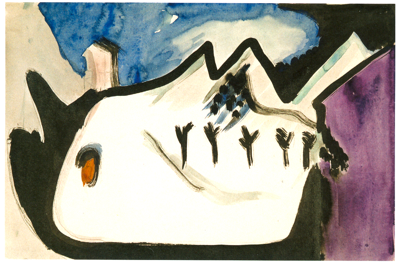
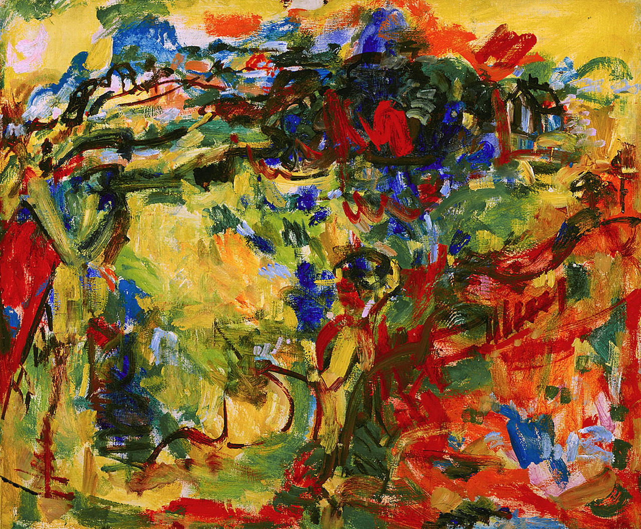
Hans Hofmann, Spring, 1944-45
11.25 x 14.125 in.

Hans Hofmann (1880-1966) was an Abstract Expressionist painter.  Born in Germany, Hofmann first devoted himself to science and engineering; among his developments were an electromagnetic computer, a device for maritime radar, and a portable freezer.  However, Hofmann was compelled to develop his creativity and began his art education after the death of his father. He moved to the United States in 1932 and achieved great success as an artist and teacher.  His students included Lee Krasner and Helen Frankenthaler.  Even among his earlier work Hofmann's style demonstrates the great energy and intensity that would come to characterize his best known pieces.  The Gate is one such piece, and it presents a very strong contrast with Spring.  The Gate (1960) is a static work of great poise and restraint.  Its energy comes from the tension that stillness creates; all the movement is unseen and under the surface. Spring is quite the opposite. It is all movement and action.  Indeed it prefigures Jackson Pollock's famous action painting in some ways.  This painting's title gives a clear focus to the piece, putting the viewer in mind of the flash of colors from bright and the rapid buzzing of insects.  The liveliness here is quite astounding, and, although it is a rather small painting, Hofmann filled the canvas with such rich texture and vibrancy that it seems to contain an entire ecosystem.  The painting grips us with its rapid movement and the complex crossing of colors, as the white streaks fly over the green ground, and all the other colors flit around in between.  Despite the extent of abstraction, it is not difficult to discern the energy and presence of a spring day with this beautifully chaotic painting.

Friday, January 30, 2015

Carl Moll, Salon in the House on Hohen Warte

Carl Moll, Salon in the House on Hohen Warte, 1903

Carl Moll (1861-1945) was an Austrian painter who studied at the Academy of Fine Arts Vienna. Along with Gustav Klimt, he led the Vienna Secession, when modern artists split off from the Austrian academy in order to exhibit more avant-garde art.  Moll is considered a painter of art nouveau, but his style is quite diverse, ranging from somewhat Impressionist, to Expressionistic, to surrealist fantasy.  These landscapes show Moll's range and development, as his interest in well as the hidden depths of our surroundings.  In each example, we see the trees bend and twist in the fabric of the world.  Among Moll's most interesting pieces is his 1906 self-portrait; he portrays himself at work while surrounded by works of other artists (including a Van Gogh on the upper left).  Salon in the House on Hohen Warte is fascinating largely due to its use of space. The vantage point is situated behind a screen, peeking furtively, almost voyeuristically, into the room beyond.  The viewer cannot enter the primary picture space, and instead must lurk on the outside and try to see in.  What Moll shows us upon entry is a visually unusual scene.  The room recedes, stretching up the steps and showing the true spatial relationship of everything in the room.  The effect is a bit unnerving, but quite engaging.  Moll enhances the technique immensely with that rich azure blue.  The color draws the eye so that we take in the entire room, and gives the background much more visual prominence than is common.  In the foreground (well middleground if we consider the screen), the two figures are quite small and the woman's face is even cut off by the screen, but they are important for drawing the composition together.  They provide a narrative focal point, and would usually be the center of visual attention, but Moll shuns that expectation. He even gives the richly textured chairs more prominence.  With all of this in mind, the painting becomes an exploration of the nature of space, the relationship of subject and painter, as well as some very bold interior design.

Thursday, January 29, 2015

Paul Cezanne, Chateau Noir

Paul Cezanne, Chateau Noir, c1904

Paul Cezanne (1839-1906) is one of the most prominent painters of the late 19th century.  He was the first painter to deconstruct the visual elements of his subjects, leading directly to Cubism and Modernism.  Picasso called him "the father of us all."  Cezanne used small brushstrokes and large swaths of color to build his forms, creating portrayals that are simultaneously soft and angular.  Among his most famous subjects are his numerous still-lifes, particularly of apples.  He also painted numerous portraits.  I chose to write about Chateau Noir because it grabbed my attention and wouldn't let go.  Cezanne painted several views of the Chateau Noir around this time. Like many of his late paintings, they are darker and less airy than his earlier landscapes, especially true of this piece.  Instead of an open view of the subject, the trees occlude the house. The colors themselves are darker, and there is an unease at play here.  The sky is not a pale, sunny blue, but purpled and heavy.  The tree branches are angular and jagged, almost threatening. While the forms are rendered in a similar manner to Cezanne's earlier works, the indistinct character is no longer soft and warm, but hazy and foreboding.  Although I am emphasizing the menacing aspects of the painting, there is also a pure beauty here that has nothing to do with the dark tonality of the work.  Cezanne's skill is remarkable and his ability to communicate a fully realized vision of his subject is endlessly engaging.  This is a deep meditation on the chateau, and perhaps on Cezanne's feelings about nature and his surroundings in general.  The intensity of feeling that infuses every masterful brushstroke is what truly holds our gaze.

Wednesday, January 28, 2015

J.E.H. MacDonald, Leaves in the Brook

J.E.H. MacDonald, Leaves in the Brook, 1919

James Edward Harvey MacDonald (1873-1932) was a Canadian painter and a founder of the Group of Seven, who helped launch the first major Canadian national art movement.  MacDonald was born in England and moved to Canada with his English mother and Canadian father, a cabinetmaker.  It was that year, at age fourteen, that young James began his first formal art training at the Hamilton School of Art in Ontario.  After attending the Central Ontario School of Art and Design, MacDonald began working as a commercial designer.  He quite his job in 1911 and moved with his wife and son to a more rural area of Ontario so that he could begin work in earnest as a landscape artist.  Some of his early work resembles Impressionism, but he soon shows the influence of Expressionism.  Throughout his career MacDonald continued to utilize different styles and explore the breadth of the Canadian landscape.  Rather than a vast panoramic view, Leaves in the Brook is small, closeup examination of a natural element.  This painting shows the vibrant beauty of autumn as the leaves blanket, not just the brook, but the ground.  They seem to color everything, radiating their warm colors and turning even the rocks red and orange.  They flit through the brook or float on the surface like so many fish in the water. The brook itself is deep blue and purple, where it isn't white with movement, coursing through this forest scene. MacDonald's loose brushwork and flowing lines perfectly communicate the swirling waters, and the crisp autumn breeze that blows the leaves into the small current.

Tuesday, January 27, 2015

Jankel Adler, No Man's Land


Jankel Adler, No Man's Land, 1943

Today is Holocaust Remembrance Day and the 70th anniversary of the liberation of Auschwitz. As such, I chose to write about Jewish-Polish artist Jankel Adler (1895-1949).  Adler was born in Lodz, Poland as one of ten children.  He began his artistic training as an engraver with his uncle. When he moved to Germany in 1914, he began formal training as an artist.  Adler experienced his first success when he moved to Dusseldorf to teach at the Academy of Arts there and was soon awarded a gold medal at a major exhibition.  During the 1932 German elections, Adler campaigned actively against the National Socialists and for communism.  When the Nazi regime took power, Adler left Germany for Paris.  Two of Adler's paintings were included in Hitler's 1933 show of degenerate art, and four more were included in the 1937 iteration.  Adler considered his exile an act of political resistance and spent the following years traveling Europe and speaking against fascism, until the war actually broke our.  In 1939 he volunteered for the Polish army that had been reconstituted in Paris, but was discharged two years later for health reasons.  Adler painted in a style that mixed Cubism and Expressionism, with a touch of Surrealism.  Despite his political engagement, Adler's work features little direct reference to the war or the political climate in Europe.  Instead, Adler's paintings explore the human body and our relationship to our surroundings.  One painting that does address the war is The Mutilated, which shows wounded soldiers and the hardships of their amputated lives.  No Man's Land is a complex entry in the discussion of Adler's life and work.  Ostensibly, the painting is based on an experienced he had walking through fields on a warm evening, when he saw a bird singing all alone.  Certainly we can discern this scene in the painting, with a lone bird singing to the moon, but it is difficult to ignore the symbolism in this work by a persecuted Jewish artist.  With its dark coloration and ominous title, the bird seems to be singing in a landscape of death.  Perhaps Adler himself felt like the bird singing to an empty space, unheard by everyone.  Whether intentionally or not, this painting is suffused with great sadness, suffering, and depth of feeling.  We can sense the painter's intense pain at the state of Europe.  Adler died in 1949 with the knowledge that none of his nine brothers and sisters survived the Holocaust.

Monday, January 26, 2015

Blizzard in New York

I know a lot of my readers are in the New York area and enduring this blizzard.
Stay warm and safe everyone.

Childe Hassam, A New York Blizzard, 1890 

James Abbott McNeil Whistler, Nocturne in Gray and Gold: Chelsea Snow, 1876

Ernst Ludwig Kirchner, Snowy Landscape, 1930

Vasily Vereschagin, In India, The Himalayan Snow, 1874

Konstantin Yuon, The Blue Winter Day, 1915

Edvard Munch, Winter, Kragero, 1912

Hiroshige, Evening Snow on Mount Hira, 1859

Francisco Goya, The Snowstorm (Winter), 1787

M.C. Escher, Snow, 1936

Marilyn Cvitanic, After the Blizzard, 2014

Elena Maza, After the Blizzard, 2010

Claude Monet, The Magpie, 1869

Sunday, January 25, 2015

Stanislaw Witkiewicz, Sunset at Sea

Stanislaw Witkiewicz, Sunset at Sea, 1887

I have posted a lot of seascapes and a lot of sunsets on this blog, and several that are both, but they continue to engage and amaze me.  Today's selection is another fine example of the genre. Stanislaw Witkiewicz (1851-1915) was a Polish painter, as well as an architect, writer, and theorist of art and philosophy.  Witkiewicz was born in a village in the Polish-Lithuanian Commonwealth, but now sits in Lithuania, and attended school in St. Petersburg and Munich. However, he came to oppose formal education, writing that "school is completely at odds with the psychological makeup of human beings." He became a leading member of the Warsaw Positivists.  Much of his art fits firmly into Realism, but some of his landscapes have a more Romantic tone in their explorations of nature.  Sunset at Sea exhibits elements of both styles, but tends more toward Realism.  We see this fisherman rowing his boat, presumably heading back to shore for the night.  Although he is small himself, his outstretched oars span most of the canvas and his red scarf marks him prominently.  The glassy water is portrayed quite skillfully, while two other boats appear in the distance.  In the middle ground is another rowboat, perhaps another pair of fishermen or laborers, but in the far background is a steamship.  It is tiny, but its influence is palpable.  The black smoke cuts across the sky, disrupting the sunset and upsetting the tranquil scene.  This represents the industry that was overtaking these fishermen with their rowboats. Nevertheless, the sunset is quite beautiful.  It is a simpler sunset than some of the others I've written about, merely the deep orange orb against a pale and fading sky.  The deftness of Witkiewicz's use of color in the sky is remarkable, for he evokes the sunset with very few colors, but shaped and shaded to perfectly reflect evening sky.

Saturday, January 24, 2015

Tadeusz Deregowski, Central Park Symphony

Tadeusz Deregowski, Central Park Symphony, 2013

Tadeusz Deregowski (b.1969) is a contemporary artist.  Born in Zambia, Deregowski grew up in Aberdeen, Scotland and attended the Edinburgh College of Art.  Deregowski has lived in many places, including New York, and now resides in Brazil.  In his travels, Deregowski has painted the places he's been, including Aswan, Luxor, Coney Island, and Brazil.  Although he has mostly worked in landscape, Deregowski has also painted still lifes and portraits.  One of his most lauded paintings is Such Indulgence, which shows distinct influence from both Cubism and Fauvism. Central Park Symphony is an engaging painting for a number of reasons.  The piece presents a loose rendering of its subject, with the features and visitors of Central Park barely discernible.  In addition to blurring the scene, the painting blurs the distinction between light and matter.  This nighttime scene is very well lit, and while no light source is visible within the frame, it definitely seems like it is.  Deregowski has made the leaves appear to glow and illuminate the scene. Whether like stars or fireflies or streetlights, on first glance those leaves look like so many lights popping across the canvas.  Toward the left of the painting, when the greenery of the trees gives way to the deep blue of the twilight sky, the luminous leaves do give way to actual stars, but the transition is barely noticeable.  Every element combines to create this illuminated night, a symphony of stars and leaves, all lighting up the park.

Friday, January 23, 2015

William Moore Davis, Port Jefferson Harbor

William Moore Davis, Port Jefferson Harbor


Here is a painting of my hometown by Long Island artist William Moore Davis (1829-1920).  Davis was born in neighboring Setauket and worked in the shipbuilding industry in Port Jefferson when he was a boy.  The influence of this experience can perhaps be seen in his multiple paintings of boats and ships, such as A Close Shave and Wreck at Poquot Beach.  Davis spent some time in New York City, but mostly lived around Port Jefferson and Setauket.  Another painting of Port Jefferson is Lecture Night at the Baptist Church, Port Jefferson.  Davis was friends with fellow artist and Setauket native William Sidney Mount, who was a major influence on Davis.  Although he was never a member of the group, Davis was also heavily influenced by the Hudson River School and their visions of nature and landscape. This painting of Port Jeff Harbor is a beautiful rendition of its subject.  The relationship of light and clouds is handled beautifully and the interplay of water and sky is thoroughly compelling.  Davis depicted the grass with great care, showing the fineness as well as the density of the vegetation.  The grass seems to be moving in the gentle evening breeze.  Davis did not have many exhibitions in his lifetime, but in recent decades his work has been rediscovered and his legacy preserved.  Although this is a simple scene, Davis exhibited great skill by successfully evoking the quiet beauty of this harbor.

Thursday, January 22, 2015

Helene Schjerfbeck, The Seamstress

Helene Schjerfbeck, The Seamstress, 1905
37.6 x 33.3 in.

Helene Schjerfbeck (1862-1946) was a Finnish painter, known for her works of Realism and her self-portraits, though she also explored landscape and still life.  Born in Helsinki, when Finland was a Duchy within the Russian Empire, Schjerfbeck was unable to attend school due to a hip injury (The Convalescent is perhaps inspired by this experience) and during her time at home she demonstrated a talent for art.  She was enrolled in the drawing school at the Finnish Art Society when she was eleven and she had great success there despite her young age.  By the time she was eighteen, Schjerfbeck was an award-winning, exhibited artist.  In 1880 she moved to Paris to study.  She spent the next decade dividing her time between Paris and Finland, with some time in England as well, and in 1889 The Convalescent won the bronze medal at the Paris Worlds Fair. Many of Schjerfbeck's works explore the lives of children, faced with the hardships of poverty or out of place in the adult world.  As her style progressed, Schjerfbeck became increasingly expressionistic, especially evident in the progression of her self- portraits, such as 1915's Self-portrait with Black Background and then 1939's Self-portrait with Black Mouth.  The Seamstress (The Working Woman) was painted at a time when Schjerfbeck's health had begun to deteriorate (although she would live into her eighties) and she had ceased her traveling.  She had intended it to be the first in a series showing women in different professions, which never fully materialized, but the few pieces there are demonstrate her great interest and care for women who worked for a living.  This theme was close to her heart, as she continued to work until the end of her life.  This painting shows its subject in a moment of rest, the only clue to her profession being the pair of scissors hanging from her hip on a green cord.  The woman's exhausted face gives the piece great emotionality, while her pose creates a certain tension.  Leaning forward in her chair, while the chair leans backward on the rockers, the pose creates a dissonance that evokes the hardships of this woman's life; the diagonal of the scissors cord also cuts the chair and her body at an angle, adding to this unease.  The sparse background also adds weight to the scene, and highlights the seamstress herself.  The painting demonstrates the great pathos that Schjerfbeck approached her work with.  Whether painting hungry children, tired working women, or herself, Schjerfbeck managed to inject great feeling into her work to create paintings that are emotional, thoughtful, and engaging.

Wednesday, January 21, 2015

Jan van Os, Dutch Vessels in Calm Water

Jan van Os, Dutch Vessels in Calm Water, 1770-85
12.74 x 16.7 in.

Jan van Os (1744-1808) was a Dutch painter and founder of the respected Van Os family of artists.  His wife, three, children, and grandson were all artists, mostly in the style of Dutch still life.  Jan van Os is also best known for his still lifes of fruit and flowers.  In his earlier career, Van Os explored landscapes and seascapes.  An interesting painting from this period is Winter Landscape, which shows the harsh difficulties of a rural winter.  Dutch Vessels in Calm Water is an interesting and engaging painting that has quite a bit going on.  These several ships appear becalmed, unable to move without a wind.  The calm water may not be pleasant, but dangerous. The ship on the right has begun loading passengers into a rowboat to get to shore.  Another ship has run aground on a sand bar, completely stranded in the low tide and still water.  Their failed attempts to get moving again litter the sand.  In the distance there are more than a dozen ships with the same troubles.  Van Os rendered this scene with great skill, the glassy water reflecting the ships both accurately and evocatively.  At the horizon, the water blends with the pale sky, which stretches upward into these large white clouds.  They reflect the stillness of the water, but also offer the possibility of coming winds.  Van Os depicts the clouds with great care, making them fluffy and inviting, but also communicating the difficult weather of the day.

Tuesday, January 20, 2015

Willem de Kooning, Easter Monday

Willem de Kooning, Easter Monday, 1955-56
99.25 x 76.25 in.

Willem de Kooning (1904-1997) was one of the most prominent members of the Abstract Expressionist movement.  De Kooning was born in Rotterdam and received his first artistic training in the Netherlands.  He moved to New York in 1926, traveling as a stowaway on a British freighter.  De Kooning began to distinguish himself in the late 1930s and in the 40s he became increasingly associated with Abstract Expressionism and was recognized as one of the movement's leaders, although he was against that, or any, name for the group.  In many ways de Kooning stands somewhat apart from the other members of the New York School.  While many of them were immigrants, most came to the United States when they were children and received all of their artistic education here, whereas de Kooning began his studies in Rotterdam and immigrated as a young man.  De Kooning also had less interest in psychoanalysis than many of his colleagues and took a more direct approach to his themes and imagery.  He also did not abandon figuration in favor of pure abstraction as completely as Jackson Pollock and Mark Rothko did.  Many of his works from the 1950s show abstracted but recognizable forms, such as Merritt Parkway and Woman I (one of de Kooning's most famous pieces).  Another famous work of de Kooning's is Gotham News, which is one of his more fully abstract paintings.   Easter Monday may appear completely abstract on first view, but we can actually identify certain forms. When exhibited, this painting was famously called "an abstract urban landscape" and it was taken from de Kooning's environment in downtown Manhattan.  He was particularly inspired by the relationships between the buildings and light, the way some blocked light and some light shone through in the spaces between.  There were a lot of renovations and broken down buildings at the time so such views were particularly apparent.  We see these ideas in the jumps between colors and what may seem to be empty spaces.  The haphazard nature of the piece evokes the whirlwind nature and gritty detritus of the city.  Notice also the newsprint on the right of the canvas at the top and bottom.  This was originally achieved accidentally, when he dripped oil on newspapers he had laid on the canvas but he like the effect and kept it.  This is a very large painting and its impact in person cannot be adequately described.  It hangs in the Met and I encourage all of my New York area readers to go see it.

Monday, January 19, 2015

Ansel Adams, Moonrise, Hernandez, New Mexico

Ansel Adams, Moonrise, Hernandez, New Mexico, 1941

Ansel Adams (1902-1984) is one of the best known American photographers, and his recognizable style has become quite prevalent in American culture.  He is known for his intense landscape photographs, usually of the American West, and especially Yosemite National Park. Adams achieved his distinctive style through careful observation of his subject and calibration of his equipment.  Along with Fred Archer, Adams developed the Zone System which is a much more involved approach to every element of photography, and created a systematic approach for determining the optimal camera placement and settings for a particular subject to achieve the ideal exposure and contrast.  Using the system, Adams produced photographs of great clarity and visual (and emotional) depth.  His pictures looks simultaneously incredibly real and somewhat fantastical.  Moonrise, Hernandez, New Mexico is one of Adams' most popular and celebrated photographs.  However, Adams stated that he considered it a rather ordinary photograph, but the negative was precious because he was only able to capture one shot before the light changed and he lost the scene.  One of the things that interests me about this photograph is the scale of the scene.  Most of the piece is taken up by the deep, black sky, with the small spot of the moon hanging in the black.  A thin band of clouds hangs over the mountains and field.  The settlement looks positively dwarfed by its surroundings.  This image was taken at twilight, which is how Adams captured both such a dark sky and such luminous clouds at the horizon.  We can even possibly determine the location of the setting sun, just left of center where the sky is the brightest. Adams was also a vocal environmentalist, and this piece integrates some of those ideals.  This photograph speaks quite eloquently to the vastness of nature and our minuscule place under the immense sky.

Sunday, January 18, 2015

Theodor Kittelsen, Echo

Theodor Kittelsen, Echo, 1888


Theodor Severin Kittelsen (1857-1914) was a Norwegian artists who remains one of the most popular artists in Norway.  He was a painter and illustrator and he is mostly known for his use of folk art and folktales in his work.  Many of his pieces are explicit illustrations of Nordic stories.  He painted (and drewanimal sceneslandscapes, a self-portrait, as well as some painting examining modern life.  However the majority of his work depicts stories and legends, a forest troll, a water spirit, a dragon, and the White-Bear-King-Valemon.  Echo is an early work, before Kittelsen found his greatest inspiration when illustrating the tales of Peter Christen Asbjørnsen. Instead it shows a Norwegian landscape with great majesty.  The scale of this painting is fascinating; Kittelsen rendered the boat and people quite small and at the bottom of this vertical view.  Instead the painting is taken up by this vast expanse of mountain.  The stone appears immense and towering over this glassy lake.  The small bits of snow are reminders of the harsh winter.  With the mist at the top and the reflections in the lake, we can almost hear the titular echo reverberating through these great mountain stones.  Coupled with the vast scale of nature that Kittelsen communicates, the scene also feels rather intimate when we look at the boat.  One figure stands up to shout and hear the echo, while another tries to get him to sit down; the third trails her hand in the water and seems completely uninterested in the antics behind her.  This trio feels casual and familiar, as though Kittelsen has captured them in one playful moment out of many.  Kittelsen's ability to portray both the human and natural elements of this scene is quite remarkable, for he manages to convey the importance of both in this trip across a lake.

Saturday, January 17, 2015

Stanislaw Wyspianski, View of Kościuszko Mound

Stanislaw Wyspianski, View of Kościuszko Mound, 1904

Stanislaw Wyspianski (1869-1907) was a Polish artist and writer of plays and poetry.  In addition to painting, he was also an interior and furniture designer.  Wyspianski's writing displays strong patriotic and nationalist beliefs and he joined themes of the Polish folk tradition with the modernist movement.  Born in KrakĂłw, Wyspianski was raised by his aunt and her husband after his mother's death.  His aunt and uncle were middle class intellectuals, and it was there that the young Stanislaw became acquainted with painting and his talent was recognized.  As a student, he took great interest in both art and literature, as well as Polish history, and he went on to attend the KrakĂłw Academy of Fine Arts.  After traveling Europe, he returned to KrakĂłw in 1894 and began receiving commissions, such as church stained glass.  Throughout his career Wyspianski worked in a number of genres.  He painted scenes of KrakĂłw, several portraits of his daughters and depictions of his family, as well as several self-portraits.  His vies of KoĹ›ciuszko Mound are among his most celebrated works.  He painted quite a few views of the scene (1234, 5678), each showing the mound from a great distance in different conditions. KoĹ›ciuszko Mound is a Polish monument to General KoĹ›ciuszko that sits over 1000 feet above sea level, and is itself 112 feet tall.  It is the somewhat pointed peak that appears on the mountain toward the left.  This painting, and all Wyspianski's views of the mound, present an interesting image of the monument.  Rather than conveying the great size of the monument, he chose to show it dwarfed by nature and distance.  Wyspianski's style is rather minimal in this painting, creating he basic shapes of his subject and using very loose brushwork to do so.  This gives the painting a very immediate feel, as well as adding to the distancing effect.  There also appear to be train tracks in the scene (most visible in the eighth linked painting) so the dark splotches are clouds of train smoke encroaching on the snowscape.  There is something unsettling in this painting, elicited by the bright yellow sky (a rather unnerving sunset), which appears sickly and sunny at the same time, and the shapes of the trees in the foreground that reach their finger-like branches outward.  The swirling snow adds to this sense of unease, and suggests an element of loneliness at play here.  This is underscored by the singular height of the mound that nothing can approach.  Wyspianski paints the immense size of the KoĹ›ciuszko Mound, but leaves it appearing minuscule and solitary.  He shows the beauty of the Cracovian snows and mountains, but paints them with clouds of ash under a sallow sky.  Wyspianski uses these contradictions to create an extremely engaging painting of great beauty and interest.

Friday, January 16, 2015

Leonardo da Vinci, Lady with an Ermine

Leonardo da Vinci, Lady with an Ermine, 1490
21 x 15 in.

Leonardo da Vinci (1452-1519) is perhaps the most famous artist of figure from the Italian Renaissance.  His paintings are among the most recognizable in the world and he is known for his inventions and scientific studies, considered the epitome of a Renaissance Man.  Lady with an Ermine is not quite as well known as some of da Vinci's other works, but is just as compelling. It is the second of four portraits that da Vinci painted of women (the others being Ginevra de' BenciLa belle ferronnière, and Mona Lisa).  This painting is of Cecilia Gallerini, the mistress of Leonardo's patron, Ludovico Sforza, the Duke of Milan.  The painting shows the subject in a three-quarter profile, an innovation of Leonardo's, but while her body faces left, Gallerini turns her head to the right apparently looking at an unseen person.  This gives the painting a sense of movement and mystery, and engages the viewer from every angle.  Gallerini's dress is relatively simple, which may be to indicate that she was not a noblewoman.  Many possible interpretations have been offered for the significance of the ermine. It was considered a symbol of purity, as it was believed to prefer to die than dirty its white coat (indeed Leonardo makes two separate references to this idea in his writings).  It may also have been to connect her with the Duke, who held the ermine as a personal talisman, or a reference to Gallerini's pregnancy, as weasels were associated with childbearing and she did give birth to a son in 1491.  Whatever the symbolic meaning, the ermine is a fascinating element of the composition. It looks in the same direction as Gallerini, apparently united with her, as well as creating a second focal point.  Each element of this painting is rendered with beautiful precision.  Gallerini's hair is smooth, her long fingers are beautifully drawn, and her face is beautifully sculpted.  The drapery of Gallerini's dress and the hair of the ermine's white coat are perfectly represented.  This is a beautiful portrait that expresses the subject's youth and strength.  Cecilia Gallerini was an intelligent and accomplished woman; she presided over Milan's meetings to discuss philosophy and other intellectual matters, and she invited Leonardo to attend.  She was also a gifted musician and wrote poetry.  Although she was only seventeen when she sat for the painter, Leonardo clearly conveys the brilliance and complexity of this young woman.

Thursday, January 15, 2015

Lorenzo Ghiberti, Cain and Abel

Lorenzo Ghiberti, Cain and Abel, from the Eastern Doors of the Florence Baptistery, 1425-52

Lorenzo Ghiberti (1378-1455) was a Florentine artist who worked in sculpture and metalwork.  He is best known as the creator of the bronze doors of the Florence Baptistery.  Michelangelo called them the Gates of Paradise, a name that has stuck.  The first commission took twenty-one years to complete and consisted of the North doors depicting the life of Christ.  At only 23, Ghiberti won the commission in a competition with his Sacrifice of Isaac panel.  In 1425 he received a second commission to create the East doors, which took twenty-seven years to complete.  All the panels are equally magnificent and intricate, but I found the depiction of Cain and Abel especially compelling.  The scene is quite complex and contains multiple elements of the story told in different spaces.  The panel has a left to right motion, beginning with Adam and Eve in the upper left, while Abel tends to his flock in the middle left and Cain plows his fields.  At the top and towards the right Cain and Abel make their sacrifices to God.  Just below that we see the murder, in the midst of Cain's attack on Abel.  Just below that Cain appears again to receive the curse or mark from God who appears on the far right.  It is quite remarkable that Ghiberti achieved such complex use of space and managed to clearly depict the story.  However his skill in metalwork is even more remarkable.  He makes the metal soft and hard at the same time, especially noticeable in the rock formations that take up the center of the panel; he conveys their hardness, but they appear flowing and soft as well.  He creates a different effect altogether in the leaves of the trees, which are molded quite rigidly, but only to show their density and fineness.  Ghiberti's molding of musculature is also incredibly skillful, as is the way he depicts Cain's pair of oxen, a technique that was still being worked out in the fifteenth century.  Also note the flowing curves of the river on the right, the appearance of which is mirrored in the tendrils of fire in the sacrifice.

Wednesday, January 14, 2015

John Sloan, Sunset, West Twenty-Third Street

John Sloan, Sunset, West Twenty-Third Street, 1906
24.375 x 36.25 in.

Today, another Ashcan painter, another view of New York.  After yesterday's post about George Luks, I came across this remarkable painting.  John French Sloan (1871-1951) was an American painter and a founder of the Ashcan School.  He grew up in Pennsylvania and began his artistic career there before moving to New York.  After dropping out of school at age sixteen to support his family, Sloan drew, honing his skills by making copies of DĂĽrer and Rembrandt.  He soon began selling his own etchings and got a job as an illustrator for a greeting card company.  He switched to newspaper work, in the art department of the Philadelphia Enquirer and began taking night classes at Pennsylvania Academy of Fine Arts.  Although he worked steadily in both painting and illustration, Sloan did not establish a name for himself until he moved to New York City in 1904.  He soon joined the Ashcan mission of portraying New York realistically and began producing effective works such as Dust Storm, Fifth Avenue and Wake of the Ferry.  Sloan became discontent with the "Plutocracy's government," as he called it, and joined the Socialist party with his wife.  These feelings can be seen some of his work, as he strove to portray the lives of the masses.  Sloan contributed anti-war and anti-capitalist illustrations to Socialist magazines, but always avoided propaganda on principle.  Sloan was also a successful landscape and portrait painter.  Among his best known works are McSorely's Bar and Sixth Avenue Elevated at Third Street.  Sloan committed himself to depicting everyday scenes, and always maintained that his work was sympathetic but was not intended to contain social consciousness.  This seems hard to believe considering Sloan's political engagement, but does appear to hold true for Sunset, West Twenty-Third Street.  This is, quite simply, a stunning sunset over New York City.  The color and shape of the clouds are in perfect balance to convey their luminous appearance.  Below the glowing clouds we see city buildings, largely in silhouette.  We stand on one of these rooftops, watching with a woman who has paused for the sunset in the midst of her laundry.

Tuesday, January 13, 2015

George Luks, Madison Square

George Luks, Madison Square, 1915
32 x 44 in.

George Benjamin Luks (1867-1933) was an American painter and illustrator.  He is best known for his urban street scenes, which are considered seminal to the Ashcan School, a movement that depicted the gritty reality of urban life.  Luks grew up around the coal fields of Pennsylvania, where he became acquainted with poverty and the working class as he observed his parents helping the miners' families.  Luks attended the Pennsylvania Academy of the Fine Arts before traveling to Europe to continue his studies.  Having learned from both the Old Masters and contemporary painters, Luks returned to the United States and found work in New York as an illustrator for Joseph Pulitzer's New York World.  He became a member of the New York art scene and was encouraged to spend more time on painting.  He soon developed into a powerful painter and an important member of the growing Ashcan movement.  Madison Square is very different from much of Luks's work.  It is not strongly realist and does not have a strong (apparent) political message.  Instead this is an urban scene where the city is shown with a kind of wonder. The hazy night view, that seems to be clouded by rain, captures a stunning vision of Madison Square.  The colors are intense yet gentle, and the brushwork perfectly conveys the blur of the night.  We can make out cars and buildings, but the feeling of this piece penetrates far past its individual elements.  It is a work of great artistry that communicates something indescribable and magnificent about New York at night.  Despite the cold rain, there is great warmth here.  Although it may not show the plight of the urban poor that Luks was so committed to, Madison Square upholds his mission to portray the truth of the city.

Monday, January 12, 2015

Edwin Austin Abbey, Seated Woman Wearing Elizabethan Headdress

Edwin Austin Abbey, Seated Woman Wearing Elizabethan Headdress, 1897
27.5 x 20 in.

Edwin Austin Abbey (1852-1911) was an American painter and illustrator, particularly known for his depictions of historical and Shakespearean scenes.  Among his best known works is his Coronation of Edward VII.  Abbey was born in Philadelphia and attended the Pennsylvania Academy of Fine Arts.  After initial success with his illustrations in publications like Harper's and Scribner's, Abbey moved to England in 1878 and eventually became a fully member of the Royal Academy.  This is how he came to be chosen to paint the official coronation portrait for King Edward VII.  This portrait of a seated women is a beautiful one, simple yet deep.  The piece is a drawing done in pastels, which accounts for the sketch-like appearance.  The rich color is one of the most engaging things about this work.  The variegated backdrop, displaying many shades of red, blends with the reddish-brown chair and the burgundy dress, with its beautiful drapery and fine shading.  Consequently, the woman becomes somewhat effaced, almost a feature of the scene and nothing more.  However her pale skin and dark hair command our attention, with her unusually long neck to keep our interest.  Abbey named the piece after her headdress, which is noteworthy in and of itself, but does not draw the eye the way her face does.  It is clear from this work that Abbey utilized the medium of drawing quite effectively, for the unfinished appearance of this drawing underscores the question of the subjects identity, perhaps not fully formed.  Her presence hovers between commanding and faded, just as the piece hovers between unfinished drawing and completed artwork.

Sunday, January 11, 2015

Martiros Saryan, Scene from the Train Window

Martiros Saryan, Scene from the Train Window, 1960

Martiros Saryan (1880-1972) was a major Armenian painter who was a seminal cultural figure and founder of the Armenian National School of Painting.  Born to an Armenian family in southwest Russia, Saryan attended the Moscow School of Arts, where he was heavily influenced by both Russian and Western European painters, particularly Gauguin and Matisse.  Having first visited Armenia in his early twenties, it was there that Saryan created his first significant work.  As his career progressed, and he continued to travel, Saryan experimented with Expressionism to great effect.  Saryan returned to Armenia periodically, such as to aid refugees of the Armenian genocide, but did not move there permanently until 1921, when it was part of the Soviet Union.  In the 1930s, Saryan's fame continued to increase, and he received many awards and honors, including the Order of Lenin.  Throughout his career, Saryan panted mostly landscapes and poartraits.  Scene from the Train Window is a fascinating landscape, a later work that shows Saryan's development.  The piece shows the influence of Russian and French painters, German Expressionism, as well as American Modernism (such as the desert paintings of Georgia O'Keeffe).  The vibrant swaths of color, applied rather loosely, give the painting an intense presence.  We can picture this scene passing rapidly by the window of a train that the title alludes to, as the artist struggles to capture it in an instant.  Behind the colorful and perhaps fantastical mountains, a sky of traditional blue and white appears, grounding the piece in reality and lending credence to the coloration of the mountains.  These disconnected bands of color join to form a highly evocative painting that seems to contain all of Saryan's rich experiences.

Saturday, January 10, 2015

John Collier, Lady Godiva

John Collier, Lady Godiva, 1898
56 x 72 in.

John Collier (1850-1934) was and English artist and author of the pre-Raphaelite period.  Like most Pre-Raphaelites, much of his work focused on Classical, historical, and religious scenes. Among his best known works are The Priestess of Delphi, Tannhäuser in the Venusberg, and his portrait of Charles Darwin, which successfully communicates all intensity, intelligence, and conflict that Darwin entered the world with.  Lady Godiva is a beautiful painting and an interesting version of the legend.  The story dates back to the thirteenth century, and concerns the eleventh-century Countess Godiva.  She supposedly rode her horse through the town nude and clothed only in her hair to protest her husband's oppressive taxation of the townspeople.  Although the story is considered to have no historical merit, it has certainly taken root in the popular imagination, even giving us the phrase Peeping Tom (a proclamation was issued that the citizens should stay inside with doors and shutters closed during the ride and man named Tom was the only one to disobey and spy on the countess; he was subsequently struck blind).  While most images of Lady Godiva show her proud and unabashed, Collier's seems somewhat ashamed of herself.  She crouches forward and hides herself, looking downcast.  She also appears to ride quite slowly through the streets.  Collier demonstrates his skill in the beautiful texturing of each element of the scene.  The stonework appears solid and worn, while the drapery on the horse is handled quite delicately. Godiva's soft skin and fine hair contrast with the horse's musculature and and course mane. Notice also the detailed coloration on the horse's neck that adds to the realism.  Godiva herself is rendered quite beautifully, every contour of her body depicted with great care.  Godiva's gambit works in the story, by the way.  Her husband lifted his oppressive taxes on the poor villagers.

Friday, January 9, 2015

Canaletto, Grand Canal: Looking from Palazzo Balbi

Canaletto, Grand Canal: Looking from Palazzo Balbi, c1726

Giovanni Antonio Canal (1697-1768), usually known as Canaletto, was an Italian painter and printmaker, famous for his views of Venice.  Inspired by yesterday's reference to views of Venice, I decided to write about the master of the genre.  Canaletto's most famous works, such as The Grand Canal and the Church of the Salute and Piazza San Marco, are highly detailed and realistic depictions of the city.  Canaletto painted often painted directly from nature (unusual for the time) and was committed to portraying the life and character of his city.  Canaletto also did paintings of Rome and London, as well as landscape vies of the Italian and English countryside. The painting of the Grand Canal that I chose to feature is rather different from most of Canaletto's work.  It is more atmospheric and less straightforward.  Rather than his typical sunny views of the city, Canaletto included this grey sky, which causes grey water in the canal.  The sky suggests storm clouds, so the explanation may be as simple as being the reality of what the painter observed.  Nevertheless, the image is very evocative and gives a very different impression of Venice and the Grand Canal.  Buildings are cast into shadow, and the boats do not give the impression of lively, bustling activity, but instead seem stagnant and immobilized.  The ominous sky looms over the scene, but there is still a patch of blue and lighter clouds near the center of the composition.  Canaletto assures us of the presence of light and liveliness further down the canal, that we can travel toward down the water.

Thursday, January 8, 2015

Ferdinand du Puigaudeau, Nighttime Boat Ride at Briere

Ferdinand du Puigaudeau, Nighttime Boat Ride at Briere

Ferdinand du Puigaudeau (1864-1930) was a French painter.  He experienced modest success during his life, including a solo show at the Galerie des Artistes Modernes.  He also built strong friendships with artists such as Paul Gauguin, Childe Hassam, and Edgar Degas.  However, Puigaudeau never achieved the levels of success that his friends did.  His early works demonstrate an interest in the lives of peasants, and in painting festivals and celebrations. In 1904, Puigaudeau traveled to Venice with his family, and painted over fifty views of the city. Although Puigaudea exhibits definite skill and produced beautiful paintings, he never really developed a strong artistic voice as his peers did.  When he returned to Paris from Venice, his career began to decline and never regained its vitality.  In his later years he painted bright, intense landscapes that differ from his earlier work which favored dusk and night scenes. Nighttime Boat Ride at Briere is one such painting, as well as one of Puigaudeau's most original. The simplicity of the scene is combined with the somewhat ominous clouds.  In addition to their striking coloring, the clouds loom large above the scene, a great mass of purple.  The also curl and stretch toward each other to create interesting shapes and dominate the upper part of the canvas.  The clouds are also used skillfully in their reflections to illuminate the water and the figures in the boat.  The palette throughout the painting is quite interesting, demonstrating a small range of blues and purples, that Puigaudea puts to excellent use in rendering the twilight.

Wednesday, January 7, 2015

Henri Matisse, Copse of the Banks of the Garonne

Henri Matisse, Copse of the Banks of the Garonne, 1900

Henri Matisse (1869-1954) is one of the most prominent artists of the Post-Impressionist period. He is known for his extremely vibrant colors and his fluid lines.  Matisse originally moved to Paris to study law, but after an attack of appendicitis, his mother brought him art supplies to occupy him while he recovered.  Matisse described entering "a kind of paradise" and decided to be an artist. He studied at the AcadĂ©mie Julian under William-Adolphe Bouguereau and Gustave Moreau. Matisse's early works consist mostly of still lifes and traditional scenes, which nevertheless soon bear the marks of his unique style.  Matisse explored Divisionism and Fauvism as he developed his style.  Harmony in Red (The Red Room) (1908) is often considered Matisse's masterpiece, or at least one of them, and the greatest expression of his style and aesthetic.  Copse on the Banks of the Garonne is a fascinating step in Matisse's development, as well as a beautiful landscape in and of itself.  The piece includes Matisse's experiments with color, evident in the pink sky and trees that appear blue and purple.  We also see the artist's loose brushwork and draughtsmanship used very effectively.  Matisse utilizes his technique to convey movement in the wind, and the general buzz of nature.  Although there is nothing moving in this painting, and no people or activities, this is not a landscape of serenity.  Rather, it is one of great energy where the beauty of the landscape is alive with vibrancy.

Tuesday, January 6, 2015

Frank Weston Benson, Lady Trying on a Hat

Frank Weston Benson, Lady Trying on a Hat, 1904
40.25 x 32.125 in.

Frank Weston Benson (1862-1951) was an American painter who worked in portraiture and landscape, as well as interiors and seascapes.  He was born in Salem and spent most of his life in Massachusetts.  Benson attended the School of the Museum of Fine Arts in Boston before traveling to Europe to continue his studies.  His work shows the influence of both Realism and Impressionism.  Many of Benson's paintings are of his daughters playing outside.  In Lady Trying on a Hat, Benson shows his skill in many ways.  The model, Mary Sullivan whom Benson painted numerous times, pauses in the action of adjusting the hat, with her arms raised.  He conveys both the continuing process she is engaged in and the stillness of this moment. Benson depicts many different textures in this piece, from the hard, cold Japanese vase, to the gauzy whiteness of Sullivan's dress.  The table is especially skillfully rendered, with its reflective surface and palpable wooden heaviness.  Elements like the glimmering golden belt, the hanging metal cross, and the solid dresser complete the composition.  One of the most interesting elements is the coloration around the hat.  In the literal space the painting depicts, this is caused by a light fixture shining down from the ceiling, but the effect in the painting is very different. Since the light source is unseen, the color seems to radiate from the hat itself, giving it a powerful presence.  This coloring also accentuates the blackness of the hat and its three dimensionality. With the model's delicate pose and figure, and the elaborate composition of the room around her, this painting combines all of Benson's skill with both portraiture and interior genre scenes to create a work that is poised, like the fine black hat, in an unending moment, capturing our continual interest.

Monday, January 5, 2015

Alex Katz, West Palm Beach

Alex Katz, West Palm Beach, 1997
9 x 11.7 in.


Alex Katz (b.1929) is an American artist who has worked in a variety of media, though he is best known for his paintings.  He is considered a key figure in the evolution of pop art, although his work generally resembles the movement in appearance rather than intent or ideology.  Katz paints in a number of genres, but throughout his work, he consistently reduces a subject to its most basic elements. This is evident in his portraitslandscapes, seascapesflowers, and trees.  Katz includes just enough information to communicate the content of the scene, whether simple petals and stems to create flowers, or the complex strokes needed to evoke churning waves.  By depicting only the essential lines of a subject, Katz manages to convey the emotional and physical truth of it.  In West Palm Beach, the approach creates a beautiful and fascinating piece. On a large expanse of dark blue, we see four small tendrils of color stretching into the dark. Through the use of spots and hazy lines, Katz depicts the reflections of light from the Palm Beach nightlife on shore.  The dark blue, then, is the ocean off the coast.  This simple, small painting evokes the bright attractions of the city, but does so by displaying so little that it becomes alluring and mysterious.  We have the view of someone far out to sea and looking on from a distance, and Katz challenges us to move closer and explore.

Sunday, January 4, 2015

David Wilkie, The Letter of Introduction

David Wilkie, The Letter of Introduction, 1813

Sir David Wilkie (1785-1841) was a successful Scottish painter. He worked in multiple genres, especially genre scenes and portraits. He was prominent enough to be commissioned to paint King George IV, King William IV, and Queen Victoria. The Letter of Introduction is based Wilkie's own experience of arriving in London with letters for potential patrons who had no interest in him. The young man is dressed formally and stands awkwardly, while the old man is in his dressing gown and looks askance at his visitor, clearly disdainful. The dog sniffs the newcomer curiously. Wilkie's skill is evident in communicating the tension of the scene. Every element is beautifully rendered, such as the textured walls and fine chair. The detailed depiction of the bookshelves and Japanese vase are also fascinating.  Each element of the painting is carefully chosen to effectively convey the tension and discomfort that Wilkie felt in his youth, creating a powerful and beautiful painting.

Saturday, January 3, 2015

John Crome, The Steam Packet

John Crome, The Steaml Packet, 1817
20.28 x 16.7 in.

John Crome (1768-1821) was an English landscape painter, known for his scenes of Norfolk, where he lived his entire life.  He is a founder of the Norwich School of painters who were inspired by the scenery of Norfolk and influenced by Dutch Golden Age painters.  Crome was one of the first English artists to depict identifiable trees.  Most of Crome's works are landscapes of the forests and hills in Norfolk, but he also explored the extensive rivers and lakes in the county. This piece shows two jetties––or strips of land as it is not clear if they are natural or not––jutting out into the river basin, where a group of boats has moored.  In the distance we can just make out the opposite bank with a cottage and windmill.  Crome demonstrates great attention to detail, depicting individual people crowded on the boats.  Crome chose to include one steamboat amongst the four or five sailboats, indicative of the changing nature of travel at the time.  Among the most interesting aspects of the painting is the way Crome rendered the boats' reflections.  He accurately portrayed their mirror images, and successfully conveyed their hazy nature in the moving water.  Although generally considered a Romantic painter, Crome also tends toward Realism in this piece, striving to accurately depict the crowded boats and the people on them.

Friday, January 2, 2015

Yayoi Kusama, Lingering Dream

Yayoi Kusama, Lingering Dream, 1949
53.75 x 59.75

Yayoi Kusama (b.1929) is an extremely influential Japanese artist.  She has worked in a wide variety of media, including paintingsculpture, performance art, and both indoor and outdoor installation.  Kusama has been an important voice in global avant-garde movements, and influenced pop art and minimalism, including Andy Warhol and Claes Oldenburg.  Much of Kusama's early work, including her famed polka dots, which she has included in everything from early performance art to collaborations with Louis Vuitton, was drawn from hallucinations she had in her youth.  After initial success in Japan, Kusama moved to the United States in 1957. She first spent time in Seattle, but after correspondence with Georgia O'Keeffe, Kusama moved to New York.  Kusama quickly established herself in the New York art scene and was recognized as an important member of the avant-garde movement.  Despite her critical success and growing reputation, she did not have financial success.  Kusama also suffered from ill health and was repeatedly hospitalized for overwork.  As the 1960s progressed, Kusama devoted more attention to performance art, which soon turned into demonstrations.  Often protesting the Vietnam War, Kusama chose to most public venues possible and staged pieces that usually involved nudity (of herself and other performers) and sexually explicit discourse.  In 1973 Kusama returned to Japan due to her health and began to focus on writing rather than visual art.  After her departure, she was largely forgotten in the United States, with those she influenced often failing to cite her impact. However in recent years her importance has been acknowledged and her legacy restored; Kusama is now recognized as one of the most important artists to come out of Japan.  Lingering Dream was painted when Kusama was still at art school in Kyoto.  Like most Japanese people at the time, the devastation of World War II loomed large in her mind.  War-torn landscapes can be seen repeatedly in Kusama's early works, as can flowers and vegetables–images associated with growth.  However this is not an image of floral abundance, but of death and decay.  The flowers fall and break, withering away on the dying ground.  With its desolate landscape and these finely rendered broken flowers, the emotional and psychological intensity of this painting demonstrate the great depth of feeling with which Kusama approached her work, a trait that is present throughout Kusama's oeuvre.